As the S&P 500 index breaks new record in spite of political ed economic turmoil, it seems a good time to take the market pulse as we recurrently do.
Analysis of flows and liquidity, as per JP Morgan analysts, continues to show long term underweighting o equity exposure (as we mentioned in a previous missive) but also short term extreme positioning with some institutional players such as CTAs, which tend to identify their trading with momentum. JPM’s longer term stance resides on the fact that non-bank investors are currently still exposed to equities at around 41% versus a post-Lehman high point of over 47%. A persistence of low interest rates and an already high exposure to bonds should continue to favor flows to equities. However, this is the long-term picture and on a shorter scale we might be running into some headwinds as we commented already a few weeks ago.
One point of contention is the vast outperformance of a few stocks (namely the FANGS + Tesla) which have not only reached new highs since the COVID-19 crisis but also achieved nose-bleeding valuations. Even considering the clear advantages their business models seem to have over many other traditional companies, it is hard to see how they could continue to grow their sales and margins at such a torrid pace; valuations might have to adjust to a more sensible future scenario. A rotation from FANGS to value or cyclicals might be a positive element for the market which could take a breather without correcting severely as money would just rotate from one sector to another.
From a technical perspective, we provide three charts from www.indexindicators.com . All of them point to a market that short-term carries more risk than reward. The first chart shows a smoothened Put/Call ratio. This indicator is a contrarian input as it shows the net balance between speculators (buyers of calls) and fearful investors (buyers of put insurance). A very low ratio indicates that a majority of trades involve calls and therefore shows a speculative imbalance in the market often resolved in a correction.
Our second chart quantifies the breadth of the market by looking at how many stocks are trading above their 50-day moving average. While we mentioned the significant outperformance of a few companies, since the lows of March, a large majority of stocks has initiated an upward trend from the lows. When this ratio hits values in the 90s and then fails, a pause in the market often follows.
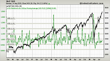
Our last chart shows the VIX or Volatility Index. The VIX produces results similar to the Put/Call ratio as it is calculated by using options prices (as opposed to the P?C ratio which uses options volumes). Relative low values indicate that risk might be mispriced. Currently, this indicator is relatively low, albeit not scarily so.
Chart 1
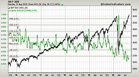
Chart 2
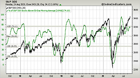
Chart 3
Overall, we reiterate our stance that on a longer-term basis, equity exposure might be increased in aggregate but we also expect volatility and opportunities to present themselves in a short-term horizon.